


Networking
29
Apr 2025
[HKGHH] Premier Networking Night @LKF
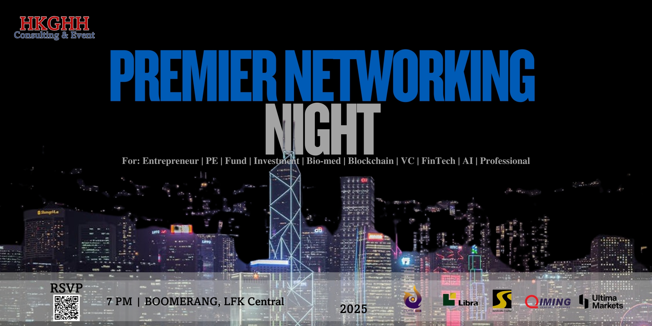
🤝 Meet Experts — from diverse fields like Fintec, VC, Bio-medical, Investment, Entrepreneur, Professional, AI, and beyond.
💡 Discover Opportunities — whether you're hiring, job hunting, freelancing, or looking to invest or collaborate.
30
Apr 2025
ESG Essentials: Sustainable Business Strategies for a Changing World
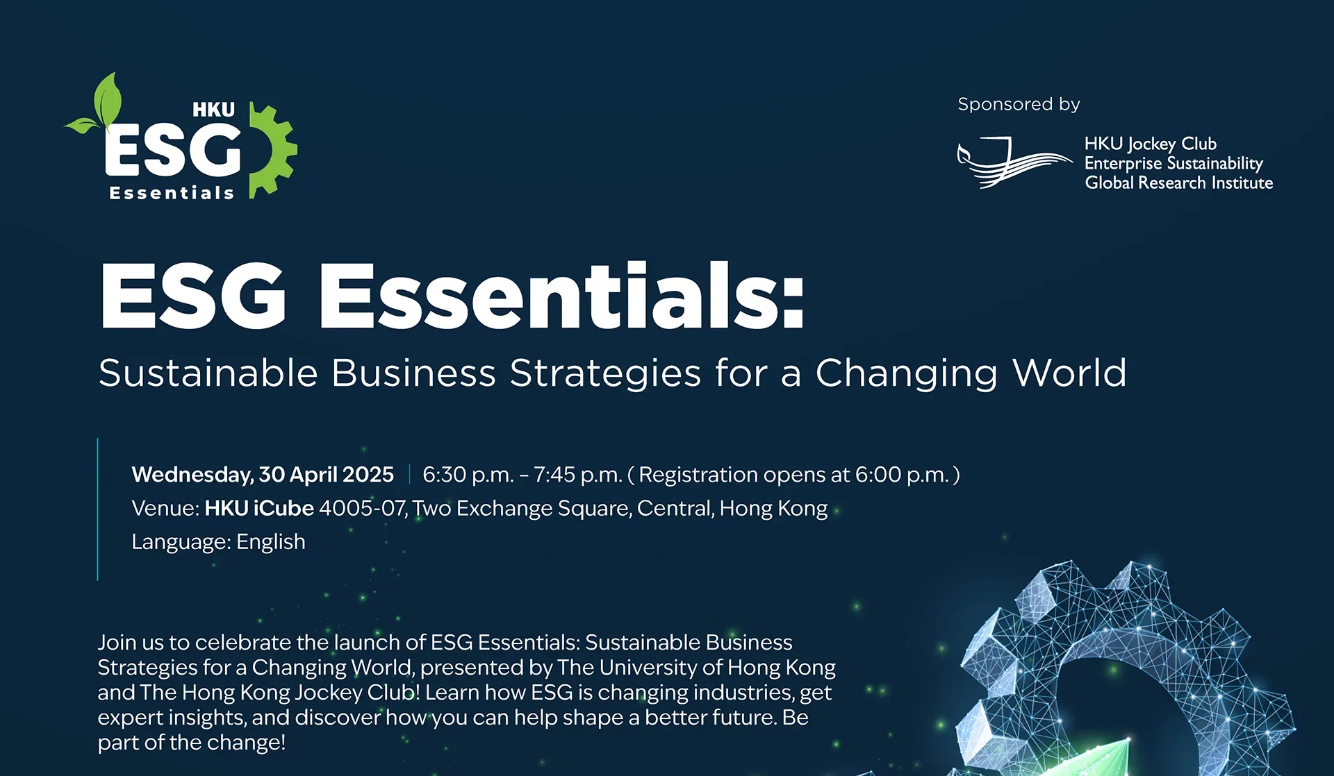
Are you an ESG professional, or looking to expand your understanding in the ESG space? Are you looking for a way to expand your knowledge of Sustainability? Looking for a career in which you can make a positive change? Then join us for the launch event of ESG Essentials: Sustainable Business Strategies for a Changing World – The University of Hong Kong and Hong Kong Jockey Club Enterprise Sustainability Global Research Institute’s new online course designed to equip you with actionable ESG knowledge.
02
May 2025
成功品牌創業分享 – 營銷平台業務
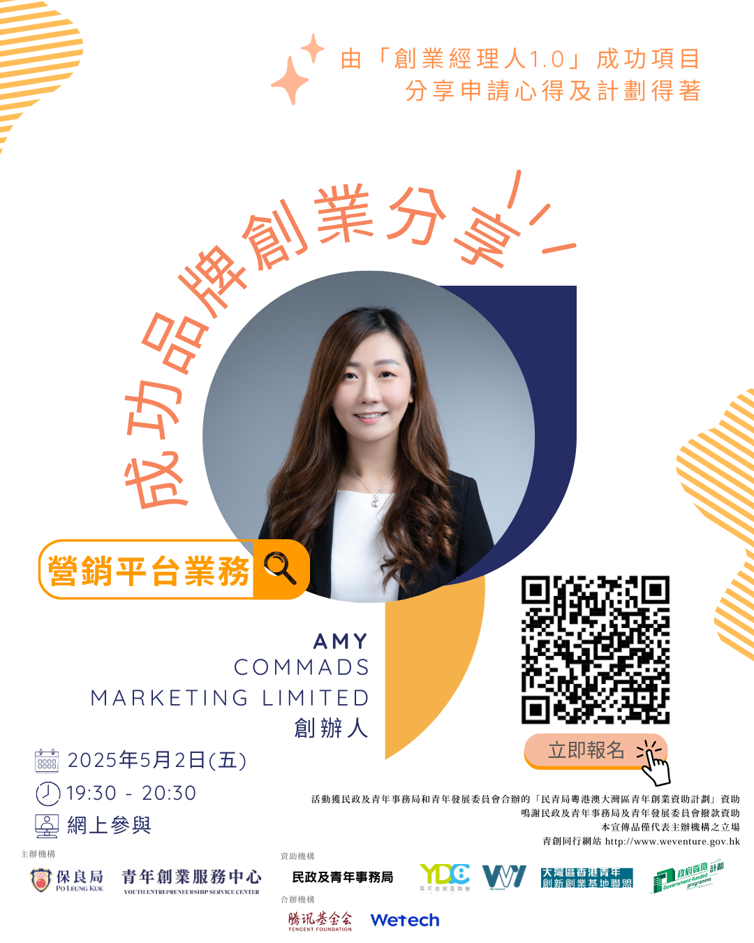
活動亮點: 1/ 真實案例分享:聽過來人點樣由零開始,善用創業計劃資源 2/ 申請秘訣大公開:點樣寫出吸引評審的計劃書?點樣突圍而出? 3/ 互動問答環節:直接向成功創業者取經,解決你的疑難 欲知更多信息,請點擊這裡。
06
May 2025
Tech to Connect 2024 AI Leaders’ Summit
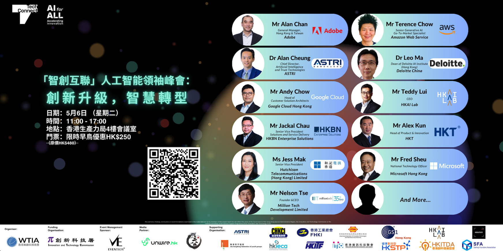
由WTIA主辦「智創互聯人工智能領袖峰會:創作升級,智慧轉型」,是一個匯集 ICT 專業人士和產業領袖的卓越平台,共同探索 AI 如何優化營運、提升決策效率,並在各行各業中釋放前所未有的生產力.
13
May 2025
[HKGHH] Premier Networking Night @LKF
🤝 Meet Experts — from diverse fields like Fintec, VC, Bio-medical, Investment, Entrepreneur, Professional, AI, and beyond.
💡 Discover Opportunities — whether you're hiring, job hunting, freelancing, or looking to invest or collaborate.
20
May 2025
「創業經理人 2.0 –向善計劃」計劃簡介會
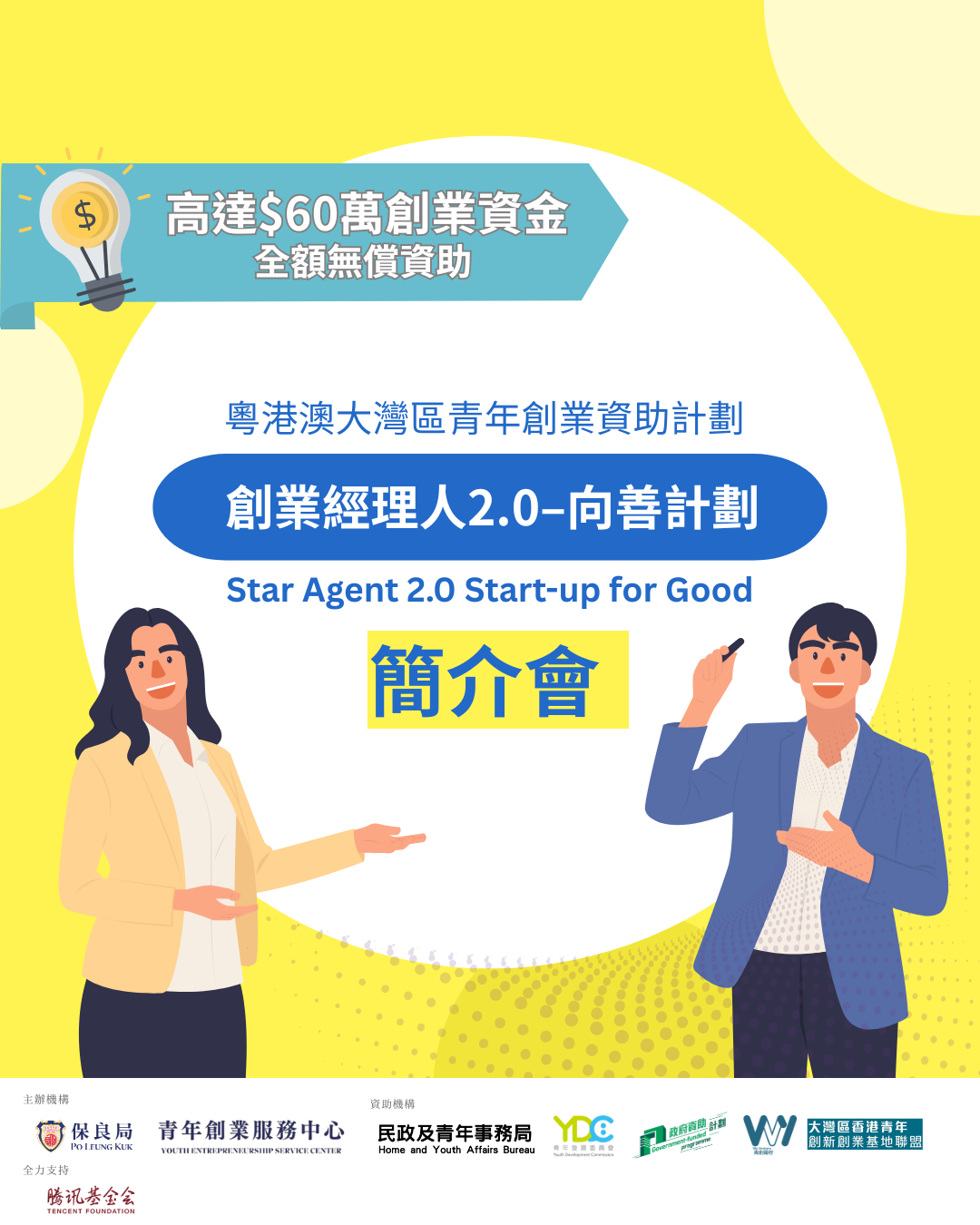
保良局主辦的「創業經理人 2.0 –向善計劃」🔥🔥 ,為18-39歲青年創業者提供最高港幣60萬元全額資助💰💰,計劃會按創業者的業務發展階段及需要,提供個人化及可持續性的支援和孵化服務。 For more details, please click here.
23
May 2025
-
24
May 2025
HK Tech 300 Expo
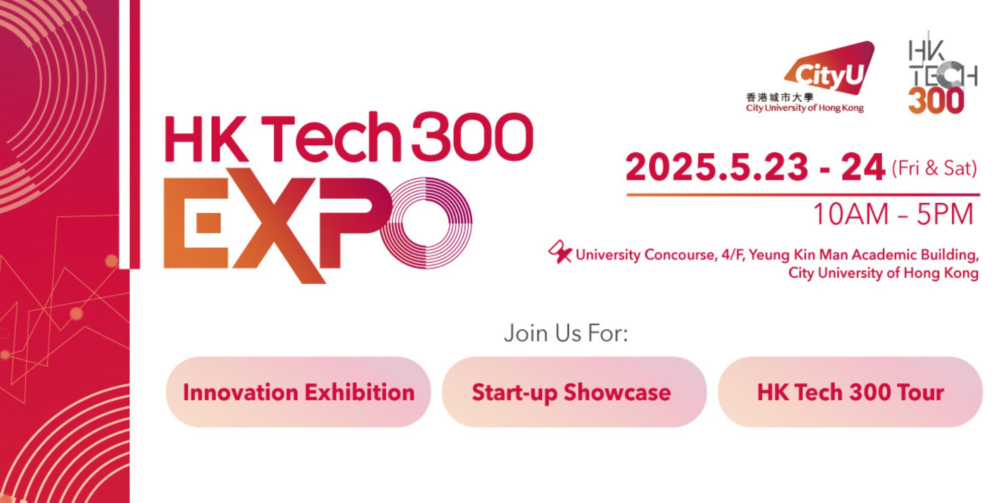
Join us on May 23-24, 2025, to explore over 200 innovative startups. Engage in dynamic networking, connect with visionary entrepreneurs and industry leaders, and discover award-winning projects. Be part of Hong Kong’s entrepreneurial spirit and transformative research!
26
May 2025
-
27
May 2025
26
May 2025
-
28
May 2025
(LAST CALL) HKTDC Hong Kong International Medical & Healthcare Fair 2025 | 26-28 May 2025
There’s no better place to showcase your medical supplies and healthcare business than in the HKIMHF
27
May 2025
[HKGHH] Premier Networking Night @LKF
🤝 Meet Experts — from diverse fields like Fintec, VC, Bio-medical, Investment, Entrepreneur, Professional, AI, and beyond.
💡 Discover Opportunities — whether you're hiring, job hunting, freelancing, or looking to invest or collaborate.